In this article, I am going to show you a few well-designed examples of order confirmation pages.
We’ll look at what makes them work well and how you can take the principles and create your confirmation page to delight customers.
We’ll first outline what is an order confirmation page, explore a few key elements, and look at a few live examples.
On This Page
What is an Order Confirmation Page?
An order confirmation is a page that customers see right after they have made a successful purchase from your store. It is also called the thank you page, as it contains a thank you message, confirmation that we have received your order, and the order details.
You can add more sections to the confirmation page like an order bump section or Google Maps to showcase your physical outlets.
Elements of an Effective Order Confirmation Page
Below are a list of the key element we see repeatedly in some of the world’s most successful stores, so it should give you an idea of the sort of things to include on your confirmation page.
- Order confirmation: Let customers know their purchase was placed successfully and if possible share the next steps of the order fulfillment process. Include key information like order number and expected delivery date.
- Enhanced Customer Experience: Now that their orders as been placed don’t end the conversation there, you can show them guides on how to best make use of their purchase. You can even invite them to join your community of like-minded individuals.
- Cross-selling and Upselling: This page gives an excellent opportunity to showcase additional products or services that might benefit your customers. It increases overall order value through relevant recommendations or special offers.
- Customer Service Contact Details: Clear list of your support procedure so that customers can reach out to your team for assistance.
- Ask for Feedback: This is a great opportunity to collect feedback on your customer’s
interaction with your brand. You can get insightful feedback that can feed into marketing and our areas of your business.
- Mobile ready: Make sure, your store’s order confirmation or thank you page is responsive and user-friendly on all screens, particularly on smartphones and tablets.
Now that we know about the order confirmation page, let’s dive into the order confirmation page examples of successful stores.
7 Thoughtful Order Confirmation Page Examples
The following are a few examples of order confirmation pages from successful stores.
1. Walmart
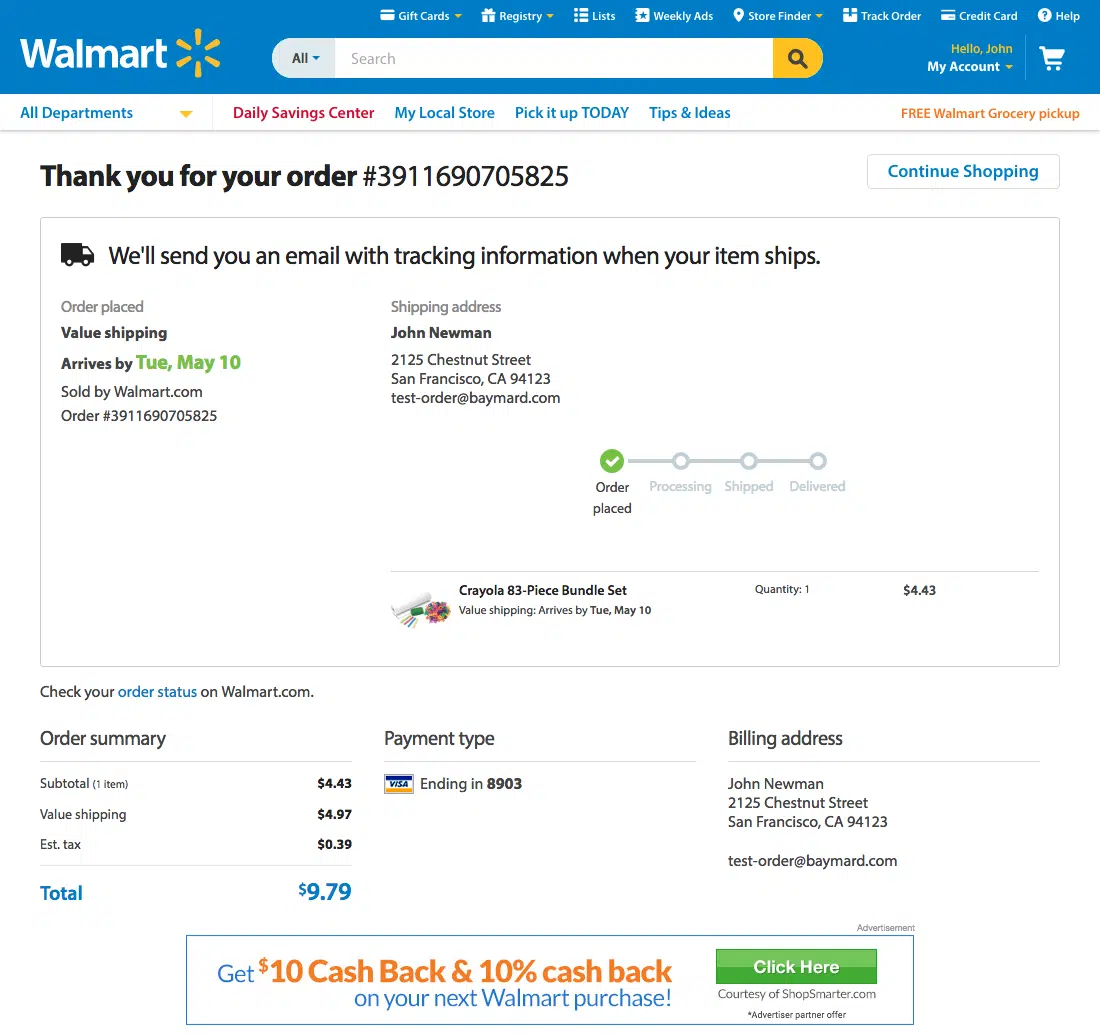
Credits: Baymard
Walmart is one of the largest retail giants in the world and its order confirmation page is a great example.
Key Takeaway:
It is well-organized and displays the required information clearly. It exemplifies simplicity and functionality, providing customers with a clear and concise summary of their transactions.
Final thoughts:
Overall, Walmart’s order confirmation page is a blend of user-friendly design and comprehensive information, aimed at customer satisfaction, and trust.
2. Adidas

Credits: Baymard
Adidas, being a global leader in sportswear, maintains an order confirmation page that aligns with its reputation for quality and customer satisfaction.
Key Takeaway:
Their order confirmation page acknowledges the customer’s purchase and outlines the next step in the order fulfillment process. They also display a Net Promoter Score survey to gauge how customers find the purchase experience.
They also encourage customers to create an account on their site so they don’t have to fill up the billing details on their next purchase.
Final Thoughts:
Overall, Adidas’s order confirmation page is an excellent example and conveys the information cleanly. It also aligns perfectly with its brand and user requirements.
3. BackDrop
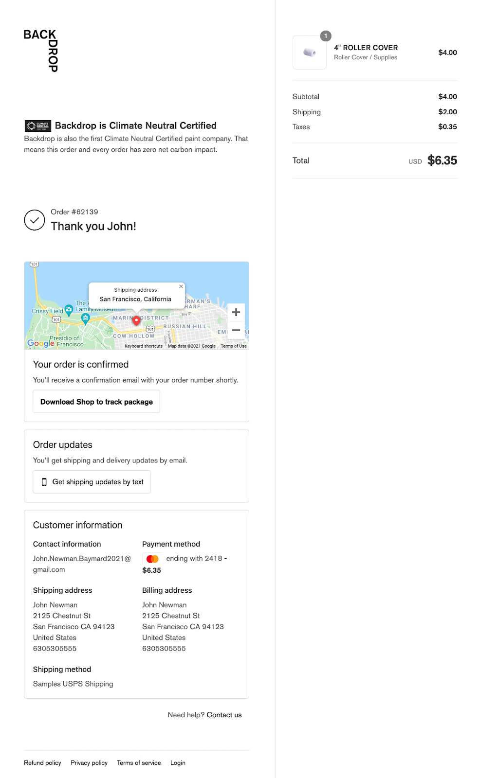
Credits: Baymard
BackDrop is a paint company and its order confirmation page is an inspiring example for new online stores.
Key Takeaway:
Their page displays the customer’s shipping address on the Maps for a better customer experience.
Moreover, they have gone a step ahead to allow customers to get shipping updates via text.
Final Thoughts:
It is one of my favourite order confirmation page examples as it utilizes the unique Google Maps feature which gives them an extra level of assurance about their order delivery. It also displays the order details in a very user-friendly manner.
4. B&H Photo Video
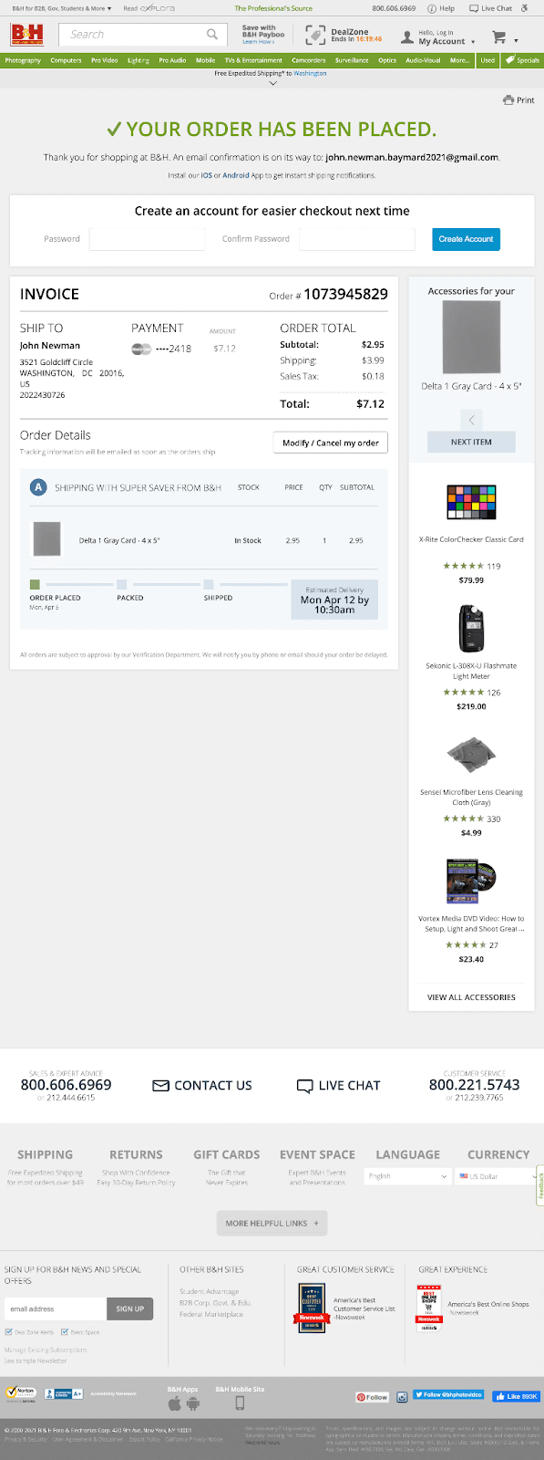
Credits: Baymard
B&H Photo Video is an electronics gadget store and has a very simple but excellent order confirmation page.
Key Takeaway:
Their order confirmation page displays the invoice and the order details in a very clear way so customers can see them without any difficulty. They also have an estimated delivery section that helps customers to track their orders.
They are also upselling different products on the order confirmation page to encourage customers to purchase more.
Final Thoughts:
Overall, it is a good example of an order confirmation or thank you page. It is focused on delivering the necessary information to the users besides utilizing the upselling technique.
5. Hamleys
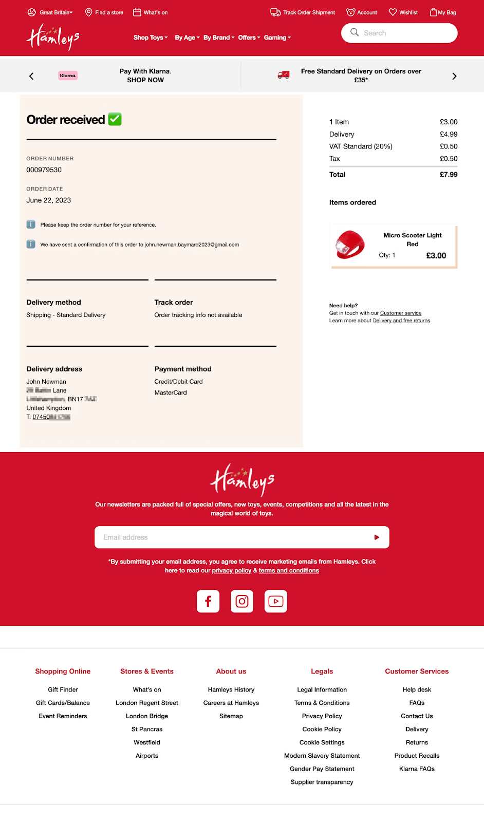
Credits: Baymard
Hamleys is a toys and games online store.
Key Takeaway:
They use a very bright color scheme but they played with it very nicely on the order confirmation page. It is a very basic page with just the information that customer needs to know about their order.
Besides, they have added a bar at the top to give free shipping to customers if their order is more than a specific amount, which is a great tactic to boost them to continue shopping.
Final Thoughts:
It is a very nicely designed, user-focused, and simple order confirmation page. They could add more sections to the page like upselling, cross-selling, or any other promotional offer to increase the revenue or AOV.
The possibilities are endless and you can test the different order confirmation pages on your store and see which one is working for you.
6. RevZilla

Credits: Baymard
RevZilla is an online motorcycle gear retail store and has a very intuitive order confirmation page.
Key Takeaway:
It shows simplicity and functionality, giving the order information to the customers clearly.
It shows a promotional offer or discount to encourage customers to join their membership for exclusive discounts.
Final Thoughts:
Overall, it is a very simple, straightforward, clear, and concise order confirmation page. Its simplicity makes it an excellent example.
7. Sephora
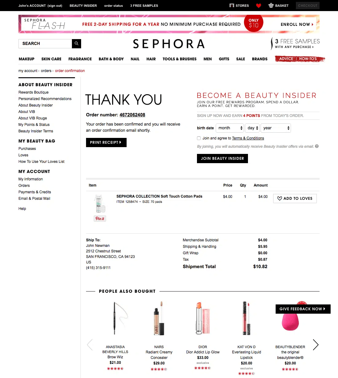
Credits: Baymard
Sephora is a beauty products online brand and its order confirmation page seems to be a good example as well.
Key Takeaway:
It is a good example but some users may find the information to be a lot congested. It is because they are displaying different menus on the page alongside the order information.
It delivers the thank you message, an option to print the receipt, and the required order and transaction details.
They are displaying the ‘People Also Bought’ section at the very end of the page by showing the other popular items to increase sales and revenue, which is a very good strategy to get repeat customers.
Final Thoughts:
It is a decent order confirmation page example with a few plus points and can be used as inspiration. It is focused on boosting sales, customer satisfaction, and trust.
How to Create an Order Confirmation Page?
When customers complete the purchase, they are displayed with the order confirmation or thank you page to confirm that their purchase was successful.
After seeing some of the best order confirmation page examples and learning about the tips & tricks to create your order confirmation page, now is the time to create one.
Specifically talking about WooCommerce, there are different plugins available in the WordPress repository that can help you create an order confirmation page but I recommend you use the AIO Checkout plugin. It is an all-in-one checkout plugin that gives you some premade thank you page or order confirmation page templates.

It also allows you to create a custom order confirmation page template to match it with your store’s overall design and color scheme. You can follow the custom order confirmation page guide to create one for your store.
Wrapping Up
That’s it for today’s article.
I hope it was helpful to you and you were able to learn something new about the order confirmation pages. I shared example order confirmation pages for some of the successful eCommerce stores to give you an idea of what it looks like and its important elements.
It is an important step to keep customers engaged with your store and encourage them to make repeat purchases.